Clamping Values
Let's suppose we have a column of text, and we want it to occupy 65% of the viewport.
We can do that with a percentage-based width, and some auto-margins for centering:
.column {
  width: 65%;
  margin-left: auto;
  margin-right: auto;
}
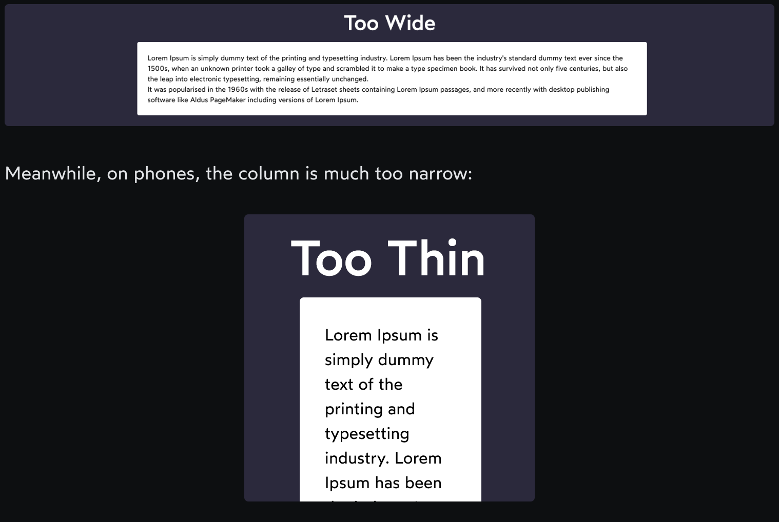
This works great for the sizes shown in the GIF, but it doesn't scale well beyond that. On large screens, the lines are much too long to read comfortably.
Meanwhile, on phones, the column is much too narrow:
We can constrain this value using our friends min-width and max-width:
.column {
  width: 65%;
  min-width: 500px;
  max-width: 800px;
  margin: 0 auto;
}
The really cool thing about min-width and max-width is that we can mix units. We can set our column to take up 65% of the available space, but limit it between 500px and 800px.
There's a problem though. When we reduce the viewport even further, we cause a horizontal overflow.
Why does this happen? Well, we've given our element a minimum width of 500px! Phone screens are narrower than that.
On mobile, we want our .column to fill the entire available width, which is the default behaviour of block-level elements. So, we can solve this by moving our styles to within a media query:
@media (min-width: 550px) {
  .column {
    width: 65%;
    min-width: 500px;
    max-width: 800px;
  }
}
We set the query to trigger at 550px, 50px larger than our minimum width. We need to add a 50px buffer because of the page's built-in padding/margin. Otherwise, we'll still overflow slightly around 500px wide.
Fortunately, we have another option: clamp. Here's what it looks like:
.column {
  width: clamp(500px, 65%, 800px);
  max-width: 100%;
  margin: 0 auto;
}
clamp takes 3 values:
The minimum value
The ideal value
The maximum value
It works quite a bit like the trio of min-width, width, and max-width, but it combines it into a single property value. In other words, these two rules are functionally identical:
/* Method 1 */
.column {
  min-width: 500px;
  width: 65%;
  max-width: 800px;
}

/* Method 2 */
.column {
  width: clamp(500px, 65%, 800px);
}
By moving our built-in constraints to the clamp value, we free up max-width. Our solution combines them:
.column {
  width: clamp(500px, 65%, 800px);
  max-width: 100%;
}
In this snippet, we're essentially applying two maximum widths: 800px and 100%. Our .column element will never be larger than 800px or 100% of the available space.
This is handy, but it's only one example of the cool things clamp can do.
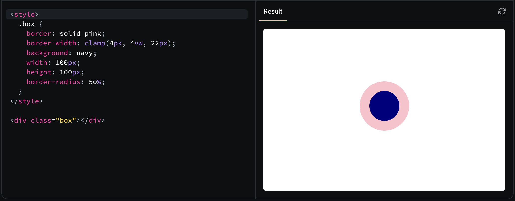
It works with other properties!
Historically, we've only been able to limit widths and heights. There is no min-padding/max-padding or min-font-size/max-font-size.
The amazing thing about clamp is that it's a value, not a property. This means that it can be used with just about any property!
Here's a silly example:
We'll see how this trick can be used to create fluid typography in an upcoming lesson.
Min and max
clamp allows us to specify a lower and upper bound. But what if we only want to limit one end?
There are min and max functions we can use as well:
.box {
  padding: min(32px, 5vw);
}
This works just like Math.min in JavaScript - it evaluates to whichever value is smaller.
In this example, our .box will have dynamic padding that scales with the viewport width, but only until it reaches 32px; it won't grow larger than that.
Browser support
clamp has very good browser support. It's supported in the latest versions of all major browsers, though it's notably absent in Internet Explorer.
For a while, clamp was less supported than its sibling functions min and max, because of Safari. Starting in Safari 13.4, however, there's no difference: all browsers support min, max, and clamp equally well.
Exercises
Max-height hero