Breakpoints
To help add structure to a chaotic world, it helps to pick a series of breakpoints.
A breakpoint is a specific viewport width that lets us segment all devices into a small set of possible experiences. For example, we might set a breakpoint at 500px. Any device under 500px will be put in the same bucket, and can be styled separately. This ensures a consistent experience.
Picking breakpoint values
There's no such thing as a universal set of "perfect" breakpoints: it will depend on your design, and the devices you target. But I do have some thoughts about how to pick a solid set of values.
Developers typically pick breakpoints based on common device resolutions. The iPhone 12 has a screen width of 375px, so maybe that'll become our "phone" breakpoint.
I don't think that this is the right approach. I believe that the most common device resolutions should sit in the middle of each grouping. A 375px iPhone should probably be in the same bucket as a 320px iPhone SE and a 412px Android phone.
In other words, we should put our breakpoints in dead zones, as far away from “real-world” resolutions as possible. They should be in “no-device land”. This way, all similar devices will share the same layout.
This data visualization shows the most popular screen resolutions by platform, according to StatCounter.

The resolutions come in several clusters. If we draw circles around them, we'll know where to put our breakpoints:
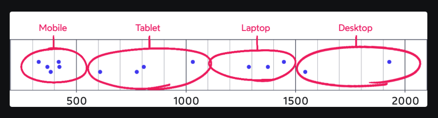
Here are the groups I've identified:
0-550px — Mobile
550-1100px — Tablet
1100-1500px — Laptop
1500+px — Desktop
I don't bother disambiguating between "small" mobile devices (like the iPhone SE, 320px-wide) and "large" mobile devices (like the iPhone X Max, 414px-wide) because I don't generally create distinct layouts for different sizes of phone. Your circumstances might vary, though! Keep your design in mind when picking breakpoint values.
Implementing breakpoints
Our exact implementation will depend on whether we go mobile-first or desktop-first.
Here's how it'd work if we go desktop-first:
/* Default: Desktop monitors, 1501px and up */

@media (max-width: 1500px) {
  /* Laptop */
}

@media (max-width: 1100px) {
  /* Tablets */
}

@media (max-width: 550px) {
  /* Phones */
}
Conversely, if we went mobile-first, it would look like this:
/* Default: Phones from 0px to 549px */

@media (min-width: 550px) {
  /* Tablets */
}

@media (min-width: 1100px) {
  /* Laptop */
}

@media (min-width: 1500px) {
  /* Desktop */
}
Some developers like to create queries for "exclusive" ranges. For example, if we wanted to target only tablet sizes—nothing smaller, nothing bigger—we could do this with the andkeyword:
@media (min-width: 550px) and (max-width: 1099.99px) {
  /* Tablet-only styles */
}
In most cases, I don't love this approach, since it forces me to complicate my mental model. But I do have to admit, there are times when this pattern comes in handy.
Managing breakpoints
Unfortunately, CSS doesn't have any built-in way to manage breakpoints. CSS has media queries, and media queries always take "raw" values (like 550px), not breakpoints.
The good news is that just about every CSS preprocessor and framework has a solution for this problem.
Here's how I've solved this using styled-components. First, I create some variables in JS:
// constants.js

// For this example, I'm going mobile-first.
const BREAKPOINTS = {
  tabletMin: 550,
  laptopMin: 1100,
  desktopMin: 1500,
}

const QUERIES = {
  'tabletAndUp': `(min-width: ${BREAKPOINTS.tabletMin}px)`,
  'laptopAndUp': `(min-width: ${BREAKPOINTS.laptopMin}px)`,
  'desktopAndUp': `(min-width: ${BREAKPOINTS.desktopMin}px)`,
}
Because our breakpoints are in no-device-land, it makes it a bit easier to name things. 550px is the smallest possible size for a tablet, so we can name the breakpoint tabletMin. The media query can be named tabletAndUp, since it includes all tablets, laptops, and desktops.
These names are a lie(warning)
For convenience, we've decided to name our media queries based on device categories. It's important to recognize that they won't actually map 1:1 to these devices.
When we talk about "popular screen resolutions", like in our data visualization above, we're talking about the monitor's maximum resolution. A popular desktop screen resolution is 1920x1080, but the user might be viewing our app in a small window sized at 500x600. They'd fall into our "phone" bucket, despite being on a desktop computer.
Similarly, tablets are often used in "landscape mode", which tends to push their resolution into the laptop bucket. But, tablets in landscape mode can now "multi-task", which might push each half into the "phone" bucket!
The point is that we don't actually know what type of device the user is using. Our breakpoints are assumptions, and those assumptions aren't always right.
If we use width-based media queries as-intended, this shouldn't cause any problems. But we do need to be careful not to "over-reach", and tweak things that shouldn't be tweaked based on window width.
Rem breakpoints
If you use something like styled-components, you can create rem-based breakpoints using pixel values like this:
// constants.js

// Values in pixels:
const BREAKPOINTS = {
  tabletMin: 550,
  laptopMin: 1100,
  desktopMin: 1500,
}

// Converted to rems:
const QUERIES = {
  'tabletAndUp': `(min-width: ${BREAKPOINTS.tabletMin / 16}rem)`,
  'laptopAndUp': `(min-width: ${BREAKPOINTS.laptopMin / 16}rem)`,
  'desktopAndUp': `(min-width: ${BREAKPOINTS.desktopMin / 16}rem)`,
}
Deviating from our breakpoints
You might be wondering: is it bad to pick "one-off" values for our media queries? What if we have a UI that needs to change CSS at a different viewport width?
No matter how perfect our breakpoints are, they'll never be suitable for 100% of cases. I think it's totally fine to use the occasional custom value.
It's important not to get too caught up in “best practices”. Sometimes, you need to do something custom in order to achieve the best possible UX, and that should be encouraged!
That said: if you find that you need to use custom values often, it's probably a sign that your breakpoints are at the wrong spots. I'd say that a well-matched set of breakpoint values should be used 80-90%+ of the time.