Other Queries
When we talk about “media queries”, we're generally talking about adapting our CSS based on the screen/window size of the client. But that's only one of the tricks media queries have up their sleeves!
Hovering
Hovering is a gesture only possible when using a pointer device, like a mouse or a trackpad. On mobile devices, we typically use our fingers, and our fingers are incapable of hovering.
When Apple created iOS Safari, they decided that tapping on an interactive element (like a link or button) should trigger the hover state. This is a questionable decision nowadays, but it made sense at the time—web developers at the time assumed that everyone could hover, since smartphones weren't a thing yet. It was common for tooltips to only be shown on hover.
Android devices work the same way. Tapping an interactive element will show the "hover" state. It'll stay hovered until you tap somewhere else.
To see how this can be a bit annoying, check out this great demo by Mezo Istvan. Try the demo first on desktop, and then on your mobile device.
If you've been an iPhone user for a few years, you may have run into some curious behaviour: sometimes, tapping a link or a button will trigger the hover state, but nothing else. It requires a second tap to actually click the link/button.
This used to happen if the element in question had a hover style that changed the visibility of an element (eg. showing/hiding a child element).
Fortunately, iOS Safari no longer behaves this way. Starting in 2019, links/buttons will always trigger a click event on tap, no matter what the hover state is.
So how do we avoid setting hover styles on mobile devices? Your first instinct might be to only apply hover styles on larger screens:
@media (min-width: 1100px) {
  button:hover {
    text-decoration: underline;
  }
}
This isn't quite right, though: after all, some users on a large desktop display will shrink their windows to a smaller size. Also, not all desktop users navigate using a pointer device. We shouldn't think of hover events as a "big screen thing", we should think of them as a "mouse/trackpad thing".
There's another media query we can use for this:
@media (hover: hover) and (pointer: fine) {
  button:hover {
    text-decoration: underline;
  }
}
This is a relatively new addition to the Media Queries specification. They're called “Interaction Media Features”. They allow us to apply styles based on which input mechanism the user is using.
What's the difference between "hover" and "pointer"? They actually refer to two distinct capabilities. hover is the ability for a device to move the cursor without also triggering a click/tap on the element underneath; a mouse can do this, but your finger or a stylus can't. pointer refers to the level of control the user has over the position of the cursor.
This table should help make this distinction clear:
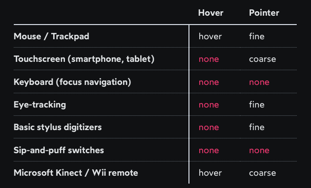
A "fine" pointer like a mouse or trackpad means that the user can be very precise with their clicks. Using our fingers on a touchscreen, though, is "coarse": we can't be anywhere near as precise.
While relatively new, interaction media features are broadly supported in all major browsers, though Internet Explorer is left out.
Boolean logic in media queries
In the hover/pointer media query above, we also introduced something new: the “and” keyword.
@media (hover: hover) and (pointer: fine) {
  /* styles */
}
“and” is essentially the same as && in JavaScript. In order for the styles to be applied, allof the queries must be satisfied.
Here's another example you may have seen before:
@media screen and (min-width: 600px) {
  /* styles */
}
screen is a “media type”. In this case, we're saying that the styles should only apply when displaying the site/app on a screen. We can also specify print styles which apply when the page is printed onto paper or saved as a PDF.
(specifying screen has become less common in recent years, as browsers have chosen more-sensible defaults when it comes to printing.)
Other boolean operators
In addition to “and”, it's also possible to specify “or” (||) as well.
Truthfully, “or” isn't super useful. it's more of an academic curiosity than something you'll use in day-to-day life.
if we want to specify that any of the conditions can be met, we can use a comma:
@media (max-width: 600px), (min-width: 800px) {
  /* styles */
}
This is effectively the same as creating two entirely-separate media queries:
@media (max-width: 600px) {
  /* styles */
}

@media (min-width: 800px) {
  /* Repeated styles */
}
Chris Coyier shared an interesting set of logical operators in a CSS Tricks article. It's a fun little rabbit hole, but ultimately these tools aren't super necessary in practical terms.
Preference-based media queries
Another feature of media queries is that they can "hook in" and access user preferences. This allows us to tailor our styles based on the user's personal preferences and needs.
For example, we can detect whether the user prefers light mode or dark mode with this media query:
@media (prefers-color-scheme: dark) {
  /* Dark-mode styles here */
}
It's not just about "preference", though. These queries allow us to create safer, more accessible experiences.
For example, some folks are sensitive to motion. Our fun parallax animation might give them a migraine, or make them feel so nauseous they need to lie down for an hour. We can avoid this by wrapping our animation-based styles in this media query:
@media (prefers-reduced-motion: no-preference) {
  /* Animations here */
}
The important takeaway is that media queries aren't just about screen sizes.
Orientation
Aside from
min-width/max-width, there are other ways to target specific window proportions. One of the most interesting isorientation:@media (orientation: portrait) { /* Styles for windows that are taller than they are wide */ } @media (orientation: landscape) { /* Styles for windows that are wider than they are tall */ }I've done some pretty extensive experimentation with this media query, and have found that it's not usually worth using. It's not as flexible as
min-width/max-width, and it leads to confusing conflicts between both types of queries.