The Magic of Calc
For almost a decade now, CSS has had the ability to do math!
.something {
  width: calc(100px + 24px); /* width: 124px; */
  height: calc(50px + 25px * 4); /* height: 150px; */
}
The expression will be evaluated, and the end result will be used as a value.
We can use 4 mathematical operators:
+(addition)-(subtraction)*(multiplication)/(division)
Why would we want to do this? For starters, it can be useful for “showing your work”. For example, which of these two declarations make it clearer that you want .something to take up 1/7th of the available space?
.something {
  width: 14.286%;
  width: calc(100% / 7);
}
The real magic of calc, though, is that it allows us to mix units:
.spill-outside {
  margin-left: -16px;
  margin-right: -16px;
  width: calc(100% + 16px * 2);
}
We're saying that this element should take up 100% of its containing block's width, plus an extra 32 pixels. Pretty neat, right?
calc gets even cooler when we combine it with CSS variables. Let's take another look at the “stacked cards” exercise (to refresh your memory, the setup here is that we have a stack of cards, and we want them to become more “compact” on smaller screens).
On small screens, --spacing is equal to 8px, and we use that value for 4 different properties. But do we really want to use the exact same values for them?
We can use --spacing as an input, and transform it to a proportional value using calc:
article {
  padding: var(--spacing);
  border-radius: calc(var(--spacing) / 2);
  /*
    8px -> 4px
    16px -> 8px
  */
}
Our equation can be more complex if we want to tweak the relationship between the values:
article {
  border-radius: calc(var(--spacing) / 2 + 2px);
  /*
    8px -> 6px
    16px -> 10px
  */
}
Unit conversion
We've talked about how the rem unit is better-suited for setting font sizes, because it can be increased or decreased by the user. But it can be harder to think in terms of rems, since they're generally multiples of 16 rather than 10.
We can use calc to convert pixels to rems.
Let's presume we want our h2 to be 24px:
h2 {
  font-size: 24px;
}
Assuming we haven't set a font-size on our HTML tag, 1rem will be equal to 16px. We can convert from pixels to rems by dividing by 16:
h2 {
  /* 24 / 16 = 1.5 */
  font-size: 1.5rem;
}
Instead of doing this math ourselves, we can let CSS do it for us, using calc:
h2 {
  font-size: calc(24 / 16 * 1rem);
}
The very first number, 24, is our value in pixels. We can use this pattern anywhere we want to be responsible and use the rem unit, without having to change our mental model.
Calculating colors and gradients
As we've learned, the HSL color model is awesome because it gives us an intuitive way to reason about color.
We can leverage that intuition to create color palettes with CSS calc:
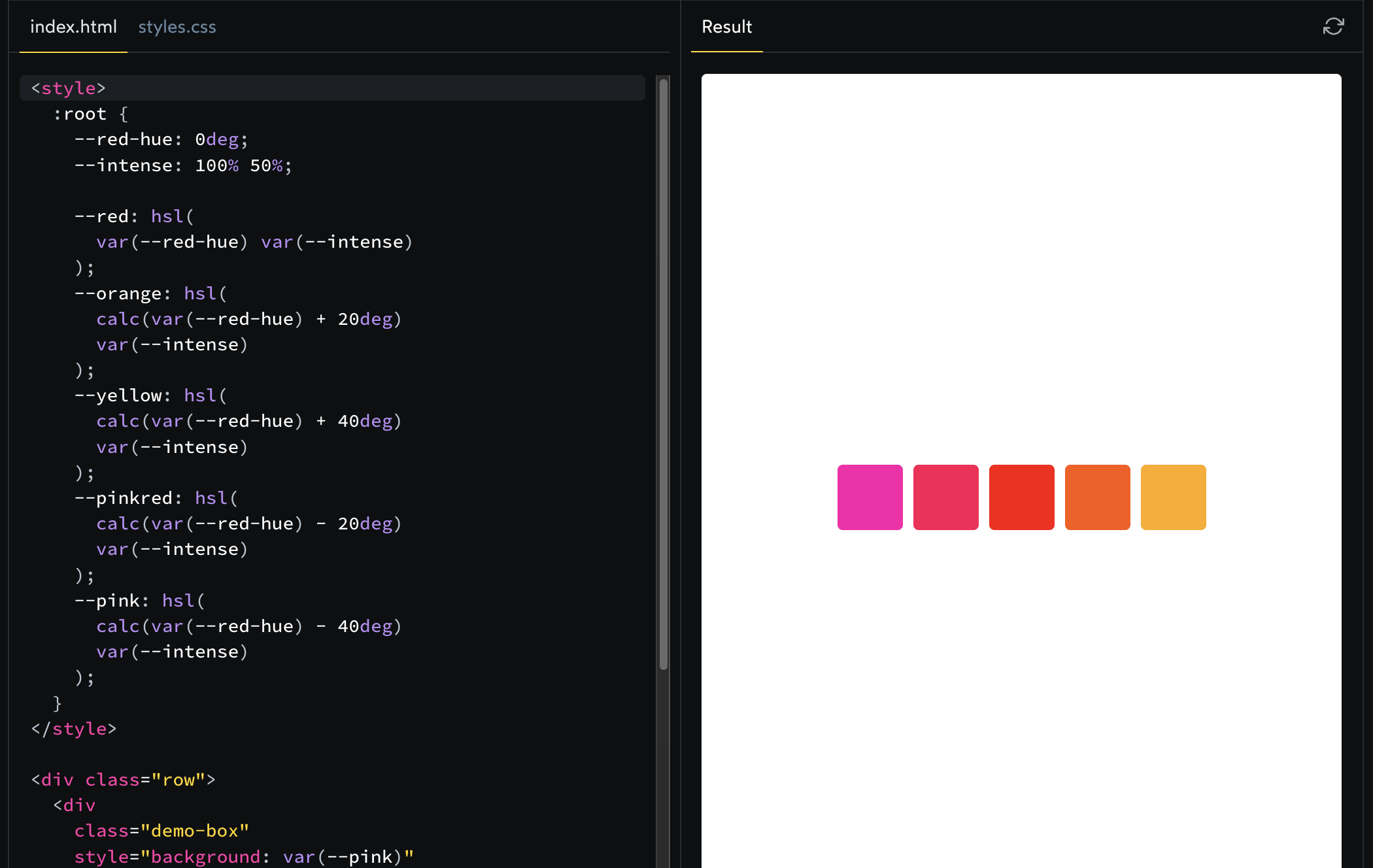
To explain what's going on here: we have a default hue, 0°. On the color wheel, 0° is "pure red". As we increase the hue, the color becomes more and more orange, and then yellow. If we spin the color wheel the other way, we veer towards pink, purple, blue.
In the code above, we're using calc to come up with new hues for each color. The 5 values used are -40°, -20°, 0°, 20°, and 40°.
Being able to use calc with color fragments is really handy when it comes to CSS gradients.
Negative values?
When we talk about color hues in HSL, we're generally thinking of them in the range of 0° to 360°. How do negative values fit in?
The trick here is that hue is a circular value. It's like rotating in a circle. If you rotate 360°, you're right back where you started.
If 0° and 360° are the same value, it stands to reason that -20° would be the same value as 340°.
We'll learn all about gradients towards the end of the course, but essentially, a linear gradient has 3 components:
A direction
A start color
An end color
(We can also specify more than 2 colors, but for now, we'll stick with 2).
Here's an example:
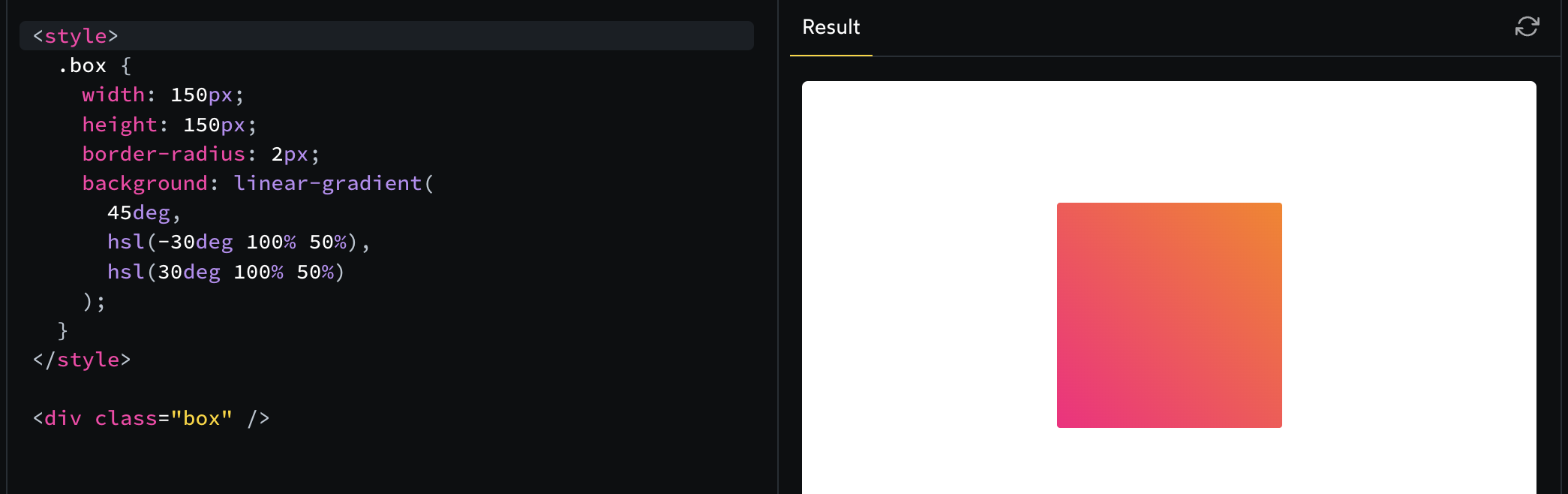
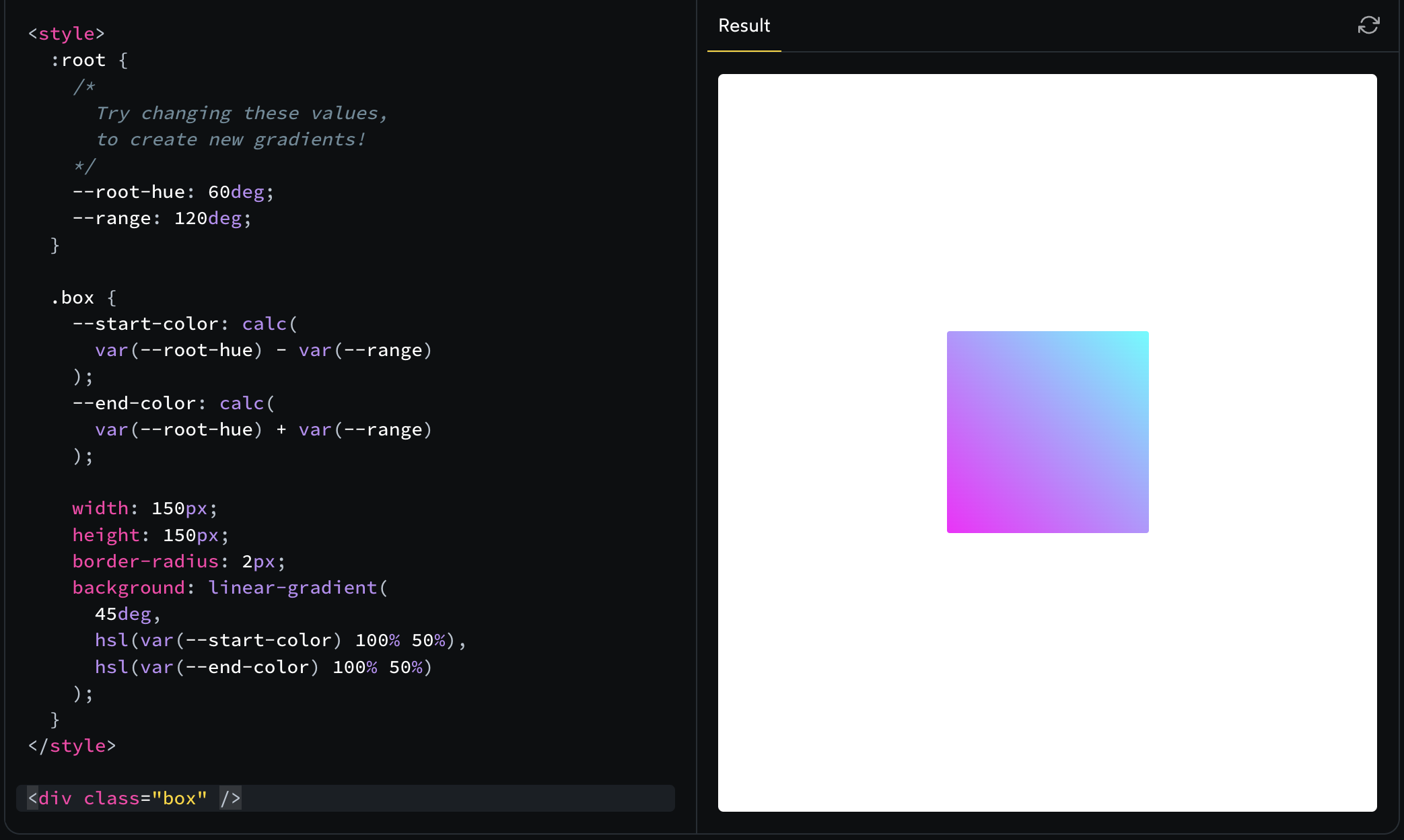
Let's see how calc gives us some knobs we can turn to tweak this gradient:
Exercise
Art project
View the code created in this video.
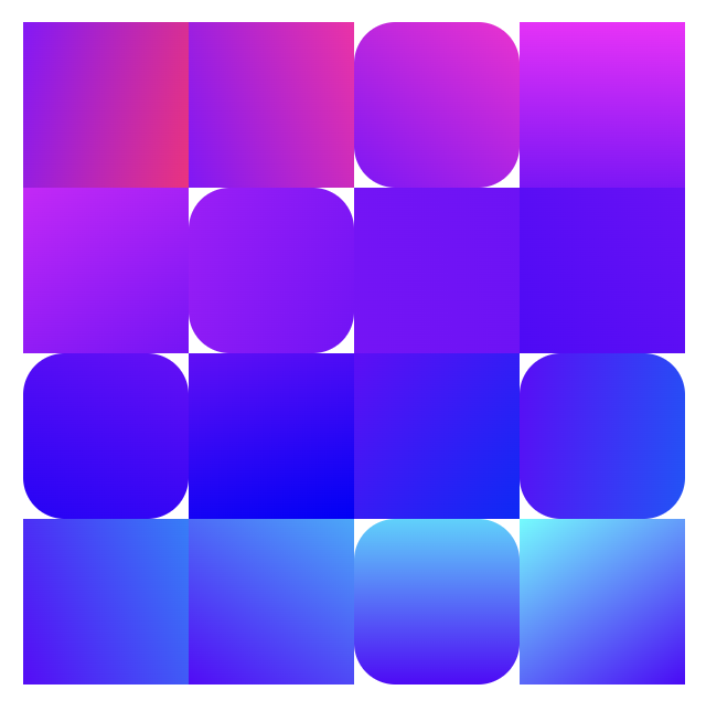
You can also view the code for the images shown above:
Generative art tools(success)
Generative art is a lot of fun, but it can also be super handy! Generative illustrations can spruce up a landing page or add visual flourish to an application.
Several tools have popped up which allow you to easily create generative art for your own projects.
I share some of my favourites over on the Treasure Trove: