Working with Mobile Devices
More pixels
Nowadays, just about every phone comes with a "High DPI" display. DPI stands for "Dots Per Inch", and it refers to the pixel density. Apple has branded this the "Retina display", but the same technology is used on Android phones.
Mobile devices have a “device pixel ratio”. This can be accessed in JavaScript with the following statement:
console.log(window.devicePixelRatio);
This number is the ratio between the physical LED pixels on the device, and the "theoretical" pixels we use in CSS.
On my iPhone, this number is 3. This means that a 10px length will actually be 30px long. Each software pixel actually corresponds to 9 hardware pixels:
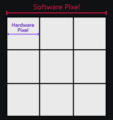
Mapping a software pixel to multiple hardware pixels happens “under the hood”. In CSS, we can only access software pixels:
.box {
  /*
    This CSS will ACTUALLY draw a
    150×150 box on a modern iPhone.
  */
  width: 50px;
  height: 50px;
  background: pink;
}
The magical meta tag
To make sure that our pages render correctly on mobile, it's imperative that we add the following meta tag to our HTML:
<meta
  name="viewport"
  content="width=device-width, initial-scale=1"
>
This tag was invented by Apple as a way to disable some of the "optimizations" that the browser makes. Android quickly adopted it as well, and it's making its way (opens in new tab) into the CSS specification.
When the iPhone was released, mobile websites didn't exist. Safari would therefore render the website as if it was a desktop browser window with a width of 980px, and then scale it down to fit on its 320px-wide screen.
width=device-width instructs the browser to set the viewport width to match the device's width (so, 320px instead of 980px). initial-scale=1 says that we should start at 1x zoom.Other options(info)
This meta tag also allows us to constrain the user's ability to zoom, either by setting a min/max scale, or by disabling it altogether.
This can be useful when building certain types of applications. For example, if we were building Google Maps, we would want to disable user scaling so that we could implement our own pinch gestures. But this is an escape hatch that 99.9% of applications don't need, and shouldn't use. Zooming is a critical browser feature, and disabling or limiting it will make our products less accessible.